
Is Poor Mobile Optimization Killing Your Sales? CRO Tips You Must Know
Did you know that over 70% of online shopping happens on mobile devices? Despite this, many eCommerce businesses still struggle with mobile optimization, leading to lost sales and frustrated customers. Studies show that 61% of users will leave a site if it isn’t mobile-friendly. In today’s fast-paced digital world, a seamless mobile experience isn’t just an advantage—it’s essential for driving conversions and retaining customers.

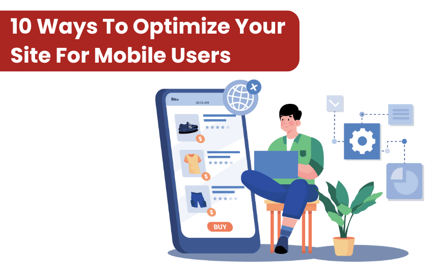
9 Ways To Optimize Your Site For Mobile Users
Here are 9 ways to optimize your site for mobile users, along with examples from real brands that have successfully implemented these strategies.
1. Simplified Mobile Navigation
Simplified navigation makes it easier for users to find what they need. This reduces frustration and supports CRO by increasing engagement and keeping users on the site longer, which can lead to higher conversion rates.
- Clear Menu Options: A cluttered menu can overwhelm mobile users. Simplify the navigation by using a hamburger menu that hides the complexity while still providing users with quick access to categories.
- Search Functionality: For many mobile shoppers, the quickest way to find a product is through the search bar. Make sure the search functionality is prominently placed and easy to use.
- Sticky Navigation: Having a sticky header allows users to access navigation and search options without scrolling back to the top. It’s especially helpful when browsing through large product catalogs.
Example: Amazon uses a streamlined hamburger menu that makes navigation easy, with quick access to categories and product pages. It’s a simple design that allows users to find what they need efficiently without distractions.
A simplified and intuitive navigation system leads to a smoother shopping experience, keeping users engaged longer.
2. Mobile-Friendly Checkout Process
Complicated checkout processes lead to cart abandonment. Streamline checkout for mobile devices to reduce friction.
- Minimize Steps: Reduce the number of pages to complete the purchase. A single-page checkout or multi-step checkout with minimal clicks can significantly reduce cart abandonment.
- Auto-Fill Forms: On mobile, typing can be cumbersome. Use auto-fill features to fill in billing and shipping information and support payment methods like Apple Pay and Google Pay to streamline the process.
- Clear Progress Indicators: Mobile shoppers appreciate knowing how much further they have to go to complete a purchase. Adding a progress bar or step indicators can reassure users and reduce anxiety during checkout.
Example: Shopify stores like Allbirds have adopted a one-page mobile checkout that reduces friction and cart abandonment. This approach shortens the overall process, improving conversion rates by allowing customers to quickly complete their purchases.
A simplified checkout process decreases friction, encouraging users to complete their purchases.
3. Faster Load Times
Slow pages of your ecommerce website frustrate mobile users, leading to abandonment. Ensure fast loading for a better mobile experience.
- Optimize Images: Compress images to reduce loading times without compromising quality. Large, high-resolution images can slow down your site, especially on mobile networks.
- Minimize HTTP Requests: Limit the number of elements on each page (like scripts and ads) to reduce the time it takes to load. Fewer elements mean faster load times.
- Leverage Browser Caching: Allow browsers to cache static content, reducing load time for repeat visitors. This ensures that users don’t have to download the same files every time they return to your site.
Example: Walmart’s mobile site is optimized for speed, ensuring fast load times even on mobile devices. Walmart invests in performance optimization tools to make sure its website delivers a seamless experience for mobile users, leading to higher engagement and conversion rates.
A fast-loading website keeps customers engaged and less likely to leave due to frustration.
4. Touch-Friendly Design
Mobile users need clear product details. Ensure your ecommerce website has quick access to key information on mobile product pages.
- Large Buttons: Buttons should be large enough to tap comfortably without mistakes. Avoid tiny buttons that require precise tapping, as they’re difficult to use on smaller screens.
- Spacious Layout: Ensure there is enough spacing between clickable elements to avoid accidental clicks. Proper spacing improves the mobile experience by making it easy to tap exactly where the user intends.
- Simple Gestures: Mobile users are familiar with gestures such as swiping to navigate through image carousels or tapping to zoom in on product images. Implementing such features can make the browsing experience feel more intuitive.
Example: Amazon has been refining its mobile app to enhance the user experience. Recent updates include larger, more vibrant graphics and dynamic product arrangements, aiming for a more intuitive and engaging interface.
5. Mobile-Optimized Product Pages
Product pages must be optimized for smaller screens. If users can’t view your products clearly or quickly find key details, they may leave without making a purchase.
- High-Quality Images: Mobile product pages should feature high-quality images that load quickly. Optimize images for fast loading without sacrificing resolution to showcase your products clearly.
- Concise Descriptions: Keep product descriptions short and to the point while highlighting key features and benefits. On mobile, it is important to avoid overwhelming users with excessive text.
- Easy-to-Read Pricing: Price information should be prominent and clear so users don’t have to search for it. Make sure the price is visible as soon as the user lands on the product page.
Example: Apple has perfected mobile product pages, featuring clean, optimized designs with concise information. Apple’s mobile pages use minimal text and large, high-resolution images, ensuring that users can quickly get all the details they need without feeling overwhelmed.
Optimized product pages enhance the shopping experience, making it easier for customers to decide on a purchase.
6. Adaptive Layouts
Your site should adjust automatically to different screen sizes. An adaptive layout ensures consistent mobile experiences.
- Responsive Design: A responsive website layout automatically adjusts its layout based on the user’s device screen size. It ensures users have an optimal experience regardless of whether they are browsing on a mobile, tablet, or desktop.
- Flexible Grids: Use flexible grid systems to arrange content in a way that fits any screen size, providing users with a consistent and seamless experience across devices.
- Test Across Devices: Regularly test your site on different devices to ensure compatibility. This ensures your mobile site is well-optimized for all users.
Example: Nike’s responsive design overhaul led to a 32% increase in mobile conversions. However, Nike has implemented a comprehensive digital transformation strategy, focusing on enhancing mobile experiences and direct-to-consumer sales. This approach has contributed to significant growth in their digital sales.
7. Easy Mobile Payments
Offering mobile-friendly payment options reduces cart abandonment and enhances conversions..
- Mobile Wallets: Integrate popular mobile wallets like Apple Pay, Google Pay, or PayPal for fast, secure transactions. These payment options are widely used and trusted by mobile shoppers.
- Autofill Information: Allow customers to use saved payment methods, such as credit cards or PayPal accounts, to speed up the checkout process. Autofill reduces friction during checkout, making it easier to complete the purchase.
- Multiple Payment Options: Offer several payment methods to accommodate a wide range of customer preferences. This flexibility helps ensure that users can complete their purchases regardless of their preferred payment method.
Example: Starbucks has integrated mobile payments into their app, allowing users to pay with just a tap. The Starbucks app makes it simple for users to load funds, place orders, and pay, all through their mobile device, resulting in higher customer satisfaction.
Mobile-friendly payment options streamline the purchasing process, making it easier for users to complete transactions.
8. Minimalist Design
Overcrowded designs with excessive text or images can overwhelm mobile users.
- Whitespace: Use whitespace effectively to avoid a cluttered look and enhance readability. It helps guide users’ attention to the most important elements on the page, making the layout more organized and user-friendly, improving overall experience and conversions.
- Bold Visuals: Use large, high-quality visuals that draw attention without overcrowding the page. Effective visuals convey the product’s value clearly, offering a better understanding and enhancing user engagement, which ultimately leads to a higher likelihood of purchase and improved sales.
- Focused Content: Highlight essential content like key product features, CTAs, and pricing for a clear path to conversion. Focus on making the product details easily accessible, ensuring the user doesn’t have to search for important information, and increasing conversion rates.
Example: Sephora’s comprehensive digital overhaul, including a personalized web experience, mobile site, and iPhone app, resulted in a significant increase in user engagement. Notably, iPad traffic doubled within the first year, and the company’s apps were downloaded over 2 million times.
9. Mobile SEO
Mobile SEO revolves around the idea of design and loading speed. It emphasizes a better mobile-user experience with the brand’s website.
- Responsive Design: Google favors websites that are mobile-friendly and adjust seamlessly to various screen sizes. Responsive design improves user experience by ensuring content displays correctly on all devices. This can significantly boost rankings and engagement, especially for mobile users.
- Fast Load Speeds: Google prioritizes websites that load quickly on all devices, particularly mobile. Slow-loading sites risk higher bounce rates and lower rankings. Use tools like Google PageSpeed Insights to identify issues, optimize images, and improve server response times.
- Mobile-Specific Keywords: Content tailored to mobile users’ search habits is essential. Identify terms mobile users commonly search for and integrate them into your content. Short, action-oriented queries perform well, helping your site gain visibility in mobile search results.
For example: IKEA implemented a responsive web design, IKEA ensured its website adapted seamlessly across various devices, enhancing user experience. This strategic move led to increased mobile traffic and higher engagement rates.
Contact Cybez: For Best Mobile Optimization
Cybez is your go-to mobile optimization agency, dedicated to transforming your website into a high-converting mobile powerhouse. We specialize in fast load speeds, seamless navigation, touch-friendly design, and mobile SEO to ensure an exceptional user experience.
Don’t let slow, unresponsive pages cost you sales. Enhance customer satisfaction, slash cart abandonment rates, and skyrocket conversions with our expert strategies. Ready to optimize your mobile experience and boost your CRO? Contact us today and take your e-commerce success to the next level!
5 FAQs: Boost Mobile Optimization for Higher Shopify Sales
1. Why is mobile optimization critical for my Shopify store’s success?
Over 70% of eCommerce traffic comes from mobile devices, and 61% of users leave a site that isn’t mobile-friendly. Poor mobile optimization leads to frustrated customers, slow load times, and higher cart abandonment. Optimizing your Shopify store for mobile improves user experience, boosts conversions, and helps you rank higher on Google.
2. How can I speed up my Shopify store for mobile users?
Speed matters on mobile!
- Compress images without losing quality
- Minimize HTTP requests by reducing scripts and unnecessary apps
- Enable browser caching
Use tools like Google PageSpeed Insights or Shopify apps such as TinyIMG to diagnose speed issues and apply fixes. A faster store keeps users engaged and increases conversion rates.
3. What makes a mobile-friendly checkout process important?
A complicated checkout is a major reason for cart abandonment. Mobile users prefer fast, simple processes:
- Use auto-fill forms
- Offer mobile wallet options like Apple Pay or Google Pay
- Display clear progress indicators
A streamlined, one-page checkout increases purchase completion rates by reducing friction during the buying process.
4. How does touch-friendly design improve the mobile shopping experience?
Touch-friendly design ensures customers can interact with your site without frustration:
- Large, easy-to-tap buttons
- Proper spacing between clickable elements
- Swipe gestures for product images
This improves usability, reduces accidental clicks, and helps shoppers browse products intuitively, boosting engagement and conversions.
5. What role does Mobile SEO play in driving traffic?
Mobile SEO ensures your Shopify store ranks well in Google’s mobile search results:
- Use responsive design
- Optimize for fast load speeds
Incorporate mobile-specific keywords
Google rewards fast, mobile-friendly sites with higher search rankings. Without proper optimization, you risk poor visibility in search results, reducing organic traffic and sales.