


Are you tired of using the same monotonous click-to-action buttons like “Click Here”? Worried about the performance of your website? Then, it’s time to boost your performance and optimize CTA for your eCommerce website. There are a lot of techniques and strategies that can be used to increase users and drive more revenue for your eCommerce. Let’s unveil some thoughtful approaches to optimize CTAs, Call-To-Action for your website.
Every business owner must clearly understand how vital a compelling call-to-action can be for their business. Ironically, the call-to-action buttons are often the essential element that falls through the cracks. Even if you don’t realize how compelling the right call-to-action can be, we will explain it thoroughly!


Explore here how Call-to-Action can allow you to bring your business to the next level.
Significance of Call-to-Action:
A CTA or call-to-action is an essential element on any website that works as a stepping stone for the users, guiding them on what they should do next. For instance, think of a CTA as a signpost with no clear direction or indication. Visitors may not understand where to go next to finish their purchase or sign up for a newsletter. A strong eCommerce CTA can help increase conversions by offering clear signposts to users.
It’s essential to remove any friction from the user journey to push them further down the sales funnel. Of course, multiple calls to action can be on each eCommerce site with different wording, sizing, colour and links.
However, there’s no perfect formula for a CTA. What works for one site may not on another, but whatever the size, shape, wording or colour, it needs to be noticeable on the page.
Different Tips for Crafting Call-To-Action Buttons:
Think carefully about the context: As you are considering exactly how to write your Call-to-Action, you must consider what you wish to get out of it. You had carefully considered your potential target audience way before you actually targeted those particular people. Hence, the Call-to-Action is merely an extension of that.
The bottom line is that your Call-to-Action must support the needs and wants of your target audience. You must be able to solve the problems of the other person. Your needs and wants will be satisfied if theirs are, and if you can accomplish that, you will be well on cementing your relationship.
Follow these tips to make your Call-to-Action buttons effective:
-
Have a goal in mind:


As you design your Call-to-Action, it is essential to remember what you wish to get out of it. You should focus on developing your Call-to-Action while keeping in mind precisely what you hope to gain in the end. It is also essential to include a link to make your audience members give you what you need with minimum effort.
-
Make it Short and sweet:
Always remember to be clear and concise. That applies to everything that you do in business, including your Call-to-Action. On an eCommerce website, you should be careful not to cram too much information or too many requests into one place. You need to be reasonable and respectful. People will like you for it.
-
Take care of proportionality of Call-to-Action:
As you are considering where to place your Call-to-Action, ensure you have a good balance between the eCommerce page and the Call-to-Action information. The proportionality is essential. The last thing you must take care of is not to annoy your target audience.
-
Make Call-to-Action do what you expect:
Your Call-to-Action needs to bring you the results that you expect. If you find that it isn’t happening the way you want it to, you should revise it until it becomes what you need it to be and does what you need it to do. It should be considered that your Call-to-Action will evolve over time. Then there will be a need to use several different ones in different contexts.
Best Practices To Optimize CTA For Your Ecommerce Website
Optimizing your CTAs is a task that’s half art and half science – it’s not always easy and possible to predict what will work. Somehow split A/B testing can help you determine this for sure.
However, there are some recommended best practices we explain here you can follow. These we present to give you a head start on optimized CTAs and ensure you don’t waste time with unworkable copies and graphics.
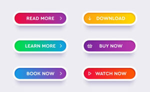
1. Keep Your CTAs Brief
CTAs which are long and wordy are ineffective. Keep them short and sweet and stick to the point, no longer than four words if possible. Make the most out of a limited space using strong verbs.


For example, short generic CTAs that work well include
“learn more”,
“get started”,
“join free”, and
“buy now”.
2. Create Urgency – FOMO (Fear of Missing)
This feeling of urgency or scarcity is a good and effective trick for boosting conversions. There are different ways you can do this:
- Use time-bound language: “start now”, “shop now”, “sign up today”.
- Use emergency words like “limited”, “reserve your spot”, “last chance”, and “sale ends tomorrow.”
- Also, don’t forget to add a countdown timer to show when the latest offers are expiring.
In general, create a “FOMO” (fear of missing out), which prompts users to complete the action or risk losing whatever you’re offering forever.
3. Make Reverse Psychology Works
You’ve seen this type of CTA on a website pop-up. It’s turned out to be trendy in the last few years as it works so well.
The concept behind it is to give the user two choices, preferably a simple “yes” or “no”, using the power of reverse psychology. Push the user towards the activity that results in conversion for you.
4. Personalize or Customize Your CTAs
It can easily boost your conversion rate by over 200%. This doesn’t imply putting “Click here [first name]!” everywhere. Still, it pays to use the available data and subtly adjust the wording of your CTA, relying on user location. It works, whether they’re a current customer or a new lead, and other relevant factors.
5. Always use Responsive Design.
Remember, at least half of your users are likely browsing your eCommerce site on a mobile device. It is important to use responsive design, so your communications are easy to read and navigate on small screens, but this is doubly important for your CTAs.


Before you publish, make sure you’ve checked the placement and appearance of your CTAs on various screen sizes and software. A promising position for your CTA to be placed is high on the page and in the middle column, the place where most of the people’s eyes go when they visit a landing page.
6. Utilize Contrasting Colors and White Space
To be effective, you must ensure your CTA stands out against everything else on the page. Contrasting colours is the simplest way to do this. If your CTA is the same colour as the rest of your text, it will blend into the background.
The maximum white space around your CTA also helps it stand out more. Take care of the size also, as it matters – makes your CTA text more prominent than the surrounding text.
Your CTA should be the first thing the user notices on the page, so don’t surround it with pics and other elements that may distract your user. Make sure the CTA design draws the eye towards the CTA.
7. Make Your CTAs Into a Button
You have the freedom to design your CTAs with plain hyperlinked text, graphics, or photographs in many different ways, but buttons convert the best by far.

The human brain is trained to expect the action when a button is pressed. These buttons are also quite tempting – any visitor will is supposed to press them (Just think of temptation with a big red button integrated with the reverse psychology trick, “don’t press this button!”)
8. Double-checking the Landing Pages
Your super-effective CTA will be useless if the user clicks it and goes to a broken page. Therefore, after finishing building the e-commerce page, don’t forget to check and click through all your CTAs. Check that the links are working the way they are supposed to and all forms are working correctly.
9. Test and Refine Perfectly
It’s quite difficult that you’ll be able to create a perfectly optimized CTA instantly. Rather, it is an ongoing process. You should continuously test and enhance your CTAs as you learn more about what is most effective for your visitors.
A/B testing is the most accepted way to do this. Take assistance of the software powered by artificial intelligence to automatically optimise the CTAs.
Now that you are aware of all the practices to make your CTAs effective, give it a try and enjoy the rush of visitors you were expecting so far.